
In this article we will see how to make graphs with SymPy and Matplotlib.
Usually when we talk about SymPy we focus on the part related to solving mathematical calculations. But many forget that the library has some basic resources for building graphs, which we will see in this article.
If you prefer to watch in video, click on the player below. The complete article is found after the video.
Creating an equation
To illustrate, I will use the ideal gas law in this article. The famous PV=nRT seen in high school. Let’s check how to make graphs that show the dependence of the volume of an ideal gas with pressure and temperature.
import sympy
from sympy.plotting import plot, plot3d
import numpy as np
import matplotlib.pyplot as plt
from matplotlib import animation


# settings for better outputs in the article, can be ignored
sympy.init_printing(
    use_latex="png",
    scale=1.0,
    order="grlex",
    forecolor="Black",
    backcolor="White",
)
Just for reference, the version of SymPy in this article is the most recent at the time I write.
sympy.__version__'1.12'
Remember that the gas constant R has several possible values depending on the unit system to be used. It is very likely that you have used the value “0.082” several times in your life because it is the value associated with the atmosphere (for pressure) and liters (for volume), which are common in most countries for these quantities. The temperature being expressed in Kelvin. In reality, this is an approximate value to facilitate the accounts made manually or in simple calculators. Here, we don’t need to approximate, so let’s put all the significant ones:
gas_constant = 0.082057366080960 # atm L / (mol K)Actually, we should not approximate. Never make approximations in intermediate steps, this will only lead to errors propagated in your calculations. But that’s a subject for another article. Just take advantage of the fact that you have a computer that handles numbers very well and don’t make approximations. If you need a “well-behaved” number for an answer, round only at the end.
Returning focus, let’s now create symbols for each quantity and create our equation. If you need any clarification about this step, see the article on equations with SymPy:
P, V, T, R, n = sympy.symbols('P V T R n', posivite=True)

ideal_gas_law = sympy.Eq(P*V, n*R*T)
ideal_gas_law
Making clear the role of each symbol:
- P: pressure in atmospheres (atm)
- V: volume in liters
- n: amount of substance in moles
- R: gas constant in atm.l/(mol.K)
- T: temperature in Kelvin
Let’s solve this equation for the volume V:
sympy.solve(ideal_gas_law, V)
See that the result comes out as a list with a single element, which is the resulting expression of isolating V from the equation on the left side of the equality. Let’s associate such expression with a variable:
volume = sympy.solve(ideal_gas_law, V)[0]  # index 0 to get the first element
volume
There are three variables in the expression. In other words, V=f(P, n,T), volume is a function of pressure, amount of substance and temperature. Let’s start simple, obtaining an expression for temperature and amount of substance constant. To do this, let’s substitute 1 mol and 25 °C (298.15 K) into the expression:
molar_volume_25_celsius = volume.subs({R: gas_constant, n: 1, T: 298.15})
molar_volume_25_celsius
Now we are in a position to make a graph showing how the volume V changes with variations in pressure P kept constant n and T at the values of 1 mol and 298.15 K, respectively.
Plots with SymPy
In the beginning of the article, we saw that we imported the plot method from SymPy. Let’s pass the expression obtained for the volume as an argument and indicate which variable, in this case P:
plot(molar_volume_25_celsius, P)
There are some interesting observations about the generated graph:
- Those who are more used to Python should have recognized the “face” of Matplotlib in the graph. And, indeed, SymPy uses Matplotlib as a backend for graphs
- Note how the axes were named. The abscissa (the “x axis”) was named P, the variable indicated when calling the
plotmethod. The ordinate (“y axis”) was named f(P), indicating that this axis is a function of P. As it is a mathematical library, SymPy assumes that y = f(x) and makes this explicit in the graph. It is possible to change these labels, but it is important to note the default representation. - Another characteristic of a mathematical library, the graph is centered at the origin (0, 0). This is not a Matplotlib standard, it is a modification made by SymPy.
- But perhaps the most striking feature is the fact that there is a part of the graph in negative values. Obviously, this does not make sense physically since it is about pressure and volume. In fact, when creating the symbols at the beginning we put
positive = True. So why did the graph appear in the 3rd quadrant?
We see in the documentation of the plot method that, by default, the domain value range considered is (-10, 10), as can be seen in the graph. Therefore, regardless of what we ask SymPy to assume when creating the symbols, the graph will be generated for the range requested by Matplotlib. But this is a practical explanation.
In reality, we have to keep in mind that all these assumptions that we ask SymPy to make, such as that a certain symbol has only positive values, are only valid within the context of SymPy operations. SymPy is a symbolic abstraction layer over pure Python. When it interacts with other libraries, such as Matplotlib, there is no way to guarantee coherent behaviors with the assumptions. The assumptions are valid within SymPy operations and are important, as we saw in the article on logarithms. However, be careful with your expectations when interacting with other libraries.
Considering these observations, let’s restrict the domain to a range that makes more sense. To do this, just pass our variable and the minimum and maximum values in a tuple:
plot(molar_volume_25_celsius, (P, 0.1, 4))
We already have the characteristic profile of an ideal gas isotherm. If we still want to restrict the graph further, to a range of smaller volume values, just pass the desired minimum and maximum values for the y axis to the ylim argument in the form of a tuple:
plot(molar_volume_25_celsius, (P, 0.1, 4), ylim=(0, 80))
And what if we want another curve on the graph? For example, for 100 °C (373.15 K)? Simple, just create the expression and pass it to the plot method:
molar_volume_100_celsius = volume.subs({R: gas_constant, n: 1, T: 373.15})plot(molar_volume_25_celsius,
molar_volume_100_celsius,
(P, 0.1, 4),
ylim=(0, 80))
We see that a second curve was created, referring to the new temperature. We could continue adding curves by doing the procedure above and, of course, improve the presentation of the graph by identifying the curves. However, it will soon become evident that interacting with Matplotlib through SymPy is very bureaucratic and limited. For example, it doesn’t make much sense to create an expression for each curve if the intention is, for example, to present curves for 5 temperatures on the graph. And this is not a criticism of SymPy, it simply is not the focus of the library to deal with graphs, they have already done a lot in putting a simplified way of generating graphs. The point is that more advanced customizations become much simpler if we extract the data from the SymPy objects and pass them directly to Matplotlib.
Plots with Matplotlib
Let’s unleash the unlimited power of Matplolib.

Thanks, Palpatine, let’s go to the Matplotlib side of the force… Let’s see how this works.
The first step is to request the plot method not to present the graph itself:
plot(molar_volume_25_celsius, (P, 0.1, 4), ylim=(0, 80), show=False)Note that only a Plot object is generated at a memory address. Therefore, we can associate such object with a variable. Let’s create a variable with the super creative name of p:
p = plot(molar_volume_25_celsius, (P, 0.1, 4), ylim=(0, 80), show=False)pWe can order the graph to be displayed from this variable:
p.show()
Now, to comprehend the next steps, let’s understand in a very simplified way the composition of a Matplotlib graph. When you look at a graph like the one above, think of it as:
- a white rectangle, which is the base of the figure
- an axis system above this rectangle
- the axis system has the line element, the labels of each axis, the values presented on the axis and everything else we see
- if wanted, new axis systems can be added to the same base figure
- and, if wanted, new lines (or points) can be added to a given axis
This is basically how graphs are created with Matplotib. More details can be seen in the Matplotlib API documentation and with a more rigorous language. The intention here is to understand that we can decompose a graph into more fundamental elements (objects in programming).
Thus, the object associated with our variable p is, in fact, a container! It has all these requirements to create a Matplotlib graph. Let’s see all the public attributes and methods associated with this object:
[x for x in dir(p) if not x.startswith('_')]['annotations', 'append', 'aspect_ratio', 'autoscale', 'axis', 'axis_center', 'backend', 'extend', 'fill', 'legend', 'margin', 'markers', 'rectangles', 'save', 'show', 'size', 'title', 'xlabel', 'xlim', 'xscale', 'ylabel', 'ylim', 'yscale', 'zlabel']
Now, it’s all there. Information about the axes, labels, (almost) everything we talked about earlier. For example, let’s check the label of the y axis and the limit we requested (from 0 to 80):
p.ylabel, p.ylim
Great! Now, there are two “suspicious” methods in this list: append and extend. They are two characteristic methods of lists, associated with the ability to increase a list by adding more elements. So… the object p was created with a list structure. And what will be the content of this list? Let’s see the first position of the list:
p[0]Hooray! A LineOver1DRangeSeries object, in other words, with all the letters, a line over a range of one-dimensional values. Translating, our curve. And, as there is only one curve, it doesn’t make sense to have an element in the next position, right?
p[1]--------------------------------------------------------------------------- IndexError Traceback (most recent call last) Cell In[20], line 1 ----> 1 p[1] File ~/.virtualenvs/chemistry/lib/python3.12/site-packages/sympy/plotting/plot.py:265, in Plot.__getitem__(self, index) 264 def __getitem__(self, index): --> 265 return self._series[index] IndexError: list index out of range
Right! So we already know that new curves are new elements in this list that is the object p. And what are the public attributes and methods available for each element of this list?
[x for x in dir(p[0]) if not x.startswith('_')]['adaptive', 'depth', 'end', 'expr', 'get_color_array', 'get_data', 'get_points', 'get_segments', 'is_2Dline', 'is_3D', 'is_3Dline', 'is_3Dsurface', 'is_contour', 'is_implicit', 'is_line', 'is_parametric', 'label', 'line_color', 'nb_of_points', 'only_integers', 'start', 'steps', 'var', 'xscale']
We see, by the names, that they are information about the curve itself: its color, number of points and the points themselves. And it is the points that we want, to be able to build our own graphs directly with Matplotlib. We can get the points with the get_points method (suggestive, isn’t it?):
# the number of values is quite long, so I used a little bit of NumPy here
# just to show the first three and the last three values of the x-axis and
# y-axis in a more friendly way. It is not necessary to get the points
# themselves, it is just a presentation artifice for the article

with np.printoptions(threshold=10, precision=3, suppress=True):
    display(np.array(p[0].get_points()))
array([[ 0.1 , 0.158, 0.222, ..., 3.888, 3.942, 4. ],
[244.654, 154.545, 110.259, ..., 6.293, 6.206, 6.116]])
As we can see, there are the values of the “x axis” from 0.1 to 4 in the first list, as requested when calling the plot method, and the associated y values in the second list. Let’s see the number of elements in each list:
len(p[0].get_points()[0]), len(p[0].get_points()[1])
The number of points is estimated by SymPy itself. It is possible to customize, but honestly, I have never found it necessary, the quantities calculated by SymPy have always provided me with well-presented graphs.
Let’s understand the structure of the object generated by get_points. We have already seen that there are two lists inside the object, but let’s see the type of the object:
type(p[0].get_points())tuple
Thus, we see that it is a tuple and, inside the tuple, there is a list for the x values and another for the y values. We already know everything we need. Let’s associate a variable with this object, create a Matplotlib figure and make our graph:
data = p[0].get_points()

fig, ax = plt.subplots(figsize=(8, 6), facecolor=(1, 1, 1))

ax.plot(*data) # unpacking the data[]

OK, this is what we alreary had so far… so what?
So now we can automate the whole creation process. Let’s generate a graph with 6 temperatures. If we were to do it via SymPy, it would be a tedious procedure, creating each expression and passing them one by one to the plot method of SymPy. Now we can do this more quickly, as we know how to extract data from SymPy.
Let’s start by creating our temperature values. No one deserves to do math in Kelvin in your head, so let’s think of round values in Celsius and let Python do the conversion for us:
temperatures_celsius = (-100, 0, 25, 100, 500, 1000)
temperatures_kelvin = tuple(t + 273.15 for t in temperatures_celsius)
Now, think. We want six graphs, we need the data for each one. Let’s create an empty list to store this data. And this data needs to be extracted from SymPy expressions with get_points. We can create each expression and extract, but we don’t actually need to create an expression for each temperature, we can reuse the same variable, there is no interest in objects for each expression. Basically, we describe a for loop:
plots = []

for temperature in temperatures_kelvin:
    expr = volume.subs({R: gas_constant, n: 1, T: temperature})
    p = plot(expr, (P, 0.1, 4), show=False)
    data = p[0].get_points()
    plots.append(data)
Note that inside the loop we did the same procedure described earlier in the article. But we were extracting the data at each step and appending it to our list. Thus, our list has 6 sets of data, a set of points (x, y), or better (P, V), for each temperature:
len(plots)
Now it’s time to use the power of Matplotib. Following the composition we talked about earlier, let’s create a figure and associate axis systems with this figure, each system with one of the curves. And, of course, identify the figure and each axis, as well as put a legend. Full service:
fig, ax = plt.subplots(figsize=(12, 8), facecolor=(1, 1, 1))

for i, p in enumerate(plots):
    ax.plot(*p, label=f'T = {temperatures_celsius[i]} °C', linewidth=3)
    ax.set_ylim(0, 80)
    ax.legend(fontsize=14)
    ax.set_ylabel('Volume / liter', fontsize=16)
    ax.set_xlabel('Pressure / atm', fontsize=16)

ax.set_title("Molar volume - ideal gas", fontsize=18)

plt.show()
ADD 3D MEME
That’s it! The procedure can now be extracted to a script, for example, and reproduced for any other case, not necessarily with the ideal gas law but with any other equation with only one variable.
But 2D is for the weak, we want 3D!

3D plots
Let’s remember the objects created at the beginning:
ideal_gas_lawvolumeAt the beginning, we fixed the temperatures at some values and generated 2D graphs, which are isotherms. But now we want the temperature to be one of the axes of the graph. Thus, the only variable we will fix is the amount of matter in moles, at the value of 1 mol:
molar_volume = volume.subs({R: gas_constant, n: 1})
molar_volume
At the beginning, we have imported the plot3d method from SymPy. The way to use it is very similar to what we saw for plot, but now we will pass intervals not only for pressure but also for temperature:
plot3d(molar_volume, (P, 0.1, 4), (T, 0, 1000))
This way, we generated a PVT surface with pressure in the range between 0.1 and 4 atm and temperature in the range of 0 to 1000 K. All the two-dimensional graphs you have seen when studying gases are nothing more than cuts in planes of surfaces like this, keeping something constant: temperature (isotherm graph), pressure (isobar graph) or volume (isometric graph).
Note that SymPy already seeks to give some touches to the graph, for example, using a color gradient on the surface, indicating with warmer colors higher values of the z axis, in our case the volume axis. But we want to have even more customization power, so let’s extract the data. The procedure is analogous to what we saw earlier:
p = plot3d(molar_volume, (P, 0.1, 4), (T, 0, 1000), show=False)pp[0]Note that the object is distinct, it is SurfaceOver2DRangeSeries, literally a surface over a range of values in two dimensions (P and T). It makes total sense in our context. Let’s see the public attributes and methods associated with this object:
[x for x in dir(p[0]) if not x.startswith('_')]['end_x', 'end_y', 'expr', 'get_color_array', 'get_meshes', 'is_2Dline', 'is_3D', 'is_3Dline', 'is_3Dsurface', 'is_contour', 'is_implicit', 'is_line', 'is_parametric', 'nb_of_points_x', 'nb_of_points_y', 'start_x', 'start_y', 'surface_color', 'var_x', 'var_y']
There is no get_points and it makes sense not to have one. When dealing with 3-dimensional surface graphs, what we have are pairs of coordinates (x, y) associated with values in z. These pairs build what is usually called a mesh grid. Indeed, there is a method in NumPy to create meshgrids that you will see in several examples in the Matplotlib documentation on the generation of 3D surfaces.
Thus, we recognize that what we want is provided by get_meshes:
# the number of values is quite long, so I used a little bit of NumPy here
# just to show the first three and the last three values of the x-axis and
# y-axis in a more friendly way. It is not necessary to get the points
# themselves, it is just a presentation artifice for the article

with np.printoptions(threshold=10, precision=3, suppress=True, linewidth=100):
    display(np.array(p[0].get_meshes()))
array([[[ 0.1 , 0.18 , 0.259, ..., 3.841, 3.92 , 4. ],
[ 0.1 , 0.18 , 0.259, ..., 3.841, 3.92 , 4. ],
[ 0.1 , 0.18 , 0.259, ..., 3.841, 3.92 , 4. ],
...,
[ 0.1 , 0.18 , 0.259, ..., 3.841, 3.92 , 4. ],
[ 0.1 , 0.18 , 0.259, ..., 3.841, 3.92 , 4. ],
[ 0.1 , 0.18 , 0.259, ..., 3.841, 3.92 , 4. ]],
[[ 0. , 0. , 0. , ..., 0. , 0. , 0. ],
[ 20.408, 20.408, 20.408, ..., 20.408, 20.408, 20.408],
[ 40.816, 40.816, 40.816, ..., 40.816, 40.816, 40.816],
...,
[ 959.184, 959.184, 959.184, ..., 959.184, 959.184, 959.184],
[ 979.592, 979.592, 979.592, ..., 979.592, 979.592, 979.592],
[1000. , 1000. , 1000. , ..., 1000. , 1000. , 1000. ]],
[[ 0. , 0. , 0. , ..., 0. , 0. , 0. ],
[ 16.746, 9.325, 6.461, ..., 0.436, 0.427, 0.419],
[ 33.493, 18.649, 12.922, ..., 0.872, 0.854, 0.837],
...,
[ 787.081, 438.261, 303.677, ..., 20.493, 20.077, 19.677],
[ 803.827, 447.586, 310.138, ..., 20.929, 20.504, 20.096],
[ 820.574, 456.91 , 316.599, ..., 21.365, 20.931, 20.514]]])
Let’s assing to a variable:
data = p[0].get_meshes()Now we have total control over what to do. For example, you didn’t understand the mesh part very well? Let’s make a graph with only points with the data:
fig = plt.figure(figsize=(12, 8), facecolor=(1, 1, 1))
ax = fig.add_subplot(111, projection='3d')

ax.scatter(*data)
ax.set_xlabel('Pressure / atm')
ax.set_ylabel('Temperature / K')
ax.set_zlabel('Volume / l')

plt.show()
See how “lines” are created, sequential values in the pressure x temperature plane, both lines parallel to the pressure axis and parallel to the temperature axis. Note, in the representation presented above of the values provided by get_meshes, how there are repeated values. This is the mesh of paired values (P, T). And for each pair we have associated a value of volume V presented on the vertical axis. I hope it has helped to understand better.
Particularly, the representation I find most useful is the “wireframe” one:
fig = plt.figure(figsize=(12, 8), facecolor=(1, 1, 1))
ax = fig.add_subplot(111, projection='3d')

ax.plot_wireframe(*data, rstride=5, cstride=5)
ax.set_xlabel('Pressure / atm')
ax.set_ylabel('Temperature / K')
ax.set_zlabel('Volume / l')

plt.show()
Do you recognize the isotherms and isobars in the graph?
Finally, we can also create surfaces:
fig = plt.figure(figsize=(12, 8), facecolor=(1, 1, 1))
ax = fig.add_subplot(111, projection='3d')

ax.plot_surface(*data)
ax.set_xlabel('Pressure / atm')
ax.set_ylabel('Temperature / K')
ax.set_zlabel('Volume / l')

plt.show()
And color it with any colormap available in Matplotlib:
fig = plt.figure(figsize=(12, 8), facecolor=(1, 1, 1))
ax = fig.add_subplot(111, projection='3d')

ax.plot_surface(*data, cmap='rainbow')
ax.set_xlabel('Pressure / atm')
ax.set_ylabel('Temperature / K')
ax.set_zlabel('Volume / l')

plt.show()
And, since we are here, let’s make this graph rotate. Why? Because yes, the graph is mine and I do wherever I want 😉
%matplotlib notebook
fig = plt.figure(figsize=(6, 4), facecolor=(1, 1, 1))
ax = fig.add_subplot(111, projection="3d")

ax.plot_surface(*data, cmap="rainbow")
ax.set_xlabel("Pressure / atm")
ax.set_ylabel("Temperature / K")
ax.set_zlabel("Volume / l")


def animate(angle):
    ax = plt.gca()  # gca = get current axis
    ax.view_init(30, angle)


anim = animation.FuncAnimation(
    fig, animate, frames=361, interval=1, repeat=False  # 360° rotation
)

plt.show()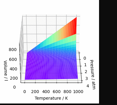
Conclusion
Two of the libraries I like the most in the same article. Although this article is part of the series on SymPy, much has been discussed about the way to build graphs with Matplotlib. This knowledge is essential to be able to extract the most of everything that is possible to do in terms of graphs. We also saw how SymPy behaves when interacting with other libraries, since not always internal instructions of SymPy are passed on to other libraries.
If you want to know when new articles are available, follow Chemistry Programming on X. The complete list of articles about SymPy can be seen in the SymPy tag. And, if you would like to see all the tutorial series posts, see the SymPy Tutorials page.
See you next time.