In this post we will see how we can use SymPy and Matplotlib, both Python packages,
to visualize ideal gas isotherms.
Brief review of the ideal gas law
Usually the first state of aggregation studied in chemistry classes is the gaseous state. The gaseous state allows a comparatively simple quantitative description.
The state of a given system is described by specifying the values of some or all of its properties. For the gaseous state, even in experiments of great refinement, only four properties – mass, volume, temperature, and pressure – are ordinarily required.
The equation of state of the system is the mathematical relationship between the values of these four properties. Only three of these must be specified to describe the state; the fourth can be calculated from the equation of state.
The most famous equation of state is the ideal gas law first stated by Benoît Paul Émile Clapeyron in 1834 as a combination of the empirical Boyle’s law,
Charle’s law, Avogadro’s law, and Gay-Lussac’s law. The ideal gas law is often written in an empirical form:
where P, V and T are the pressure, volume and temperature; n is the amount of substance; and R is the ideal gas constant.
SymPy
First, let’s import all we are going to need. Each import will be explained when used in the post.
import sympy
from sympy.plotting import plot
import numpy as np
import matplotlib.pyplot as plt

# config for better LaTeX outputs, it can be ignored
from sympy import init_printing
init_printing(use_latex='png', scale=1.05, order='grlex',
              forecolor='Black', backcolor='White', fontsize=10)
There are a great variety of unit systems that can be used. In this post we are going to consider that pressure values are in atmosphere and volume values are in liter. So, the gas constant will be:
gas_constant = 0.082057366080960 # atm L / (mol K)As stated in the project website, SymPy is a Python library for symbolic mathematics. It aims to become a full-featured computer algebra system (CAS) while keeping the code as simple as possible in order to be comprehensible and easily extensible.
Since it is symbolic, we need symbols for each property. Pay attention to the fact that a given symbol can be different from the respective variable. This is great because meaningful names can be used as code variables. Remember The Zen of Python: readability counts.
With the symbols, the ideal gas law can be created as a SymPy equality:
pressure, volume, temperature, R_constant, amount = sympy.symbols('P V T R n')

EQUATION = sympy.Eq(pressure * volume, amount * R_constant * temperature)

EQUATION
SymPy has the solve function to solve an equation for a given variable. Let’s solve our ideal gas law for the volume:
equation_volume = sympy.solve(EQUATION, volume)[0]
equation_volume
Since we are studying isotherms, let’s consider a fixed temperature of 25 °C for 1 mol of an ideal gas. Our unit system needs the temperature to be in Kelvin. Normal people don’t think in Kelvin (right?!), but as programmers we can create a function to convert a Celsius temperature to a Kelvin temperature so that we can remain sane:
def celsius_to_kelvin(temperature_in_celsius):
    return temperature_in_celsius + 273.15
Now we can substitute the desired values in our volume equation using the subs method. This method receives a dictionary with the value of each symbol:
equation_volume_25_celsius = equation_volume.subs({R_constant: gas_constant,
                                                   amount: 1,
                                                   temperature: celsius_to_kelvin(25)})
equation_volume_25_celsius
Now it is a good time for a graph! At the beginning, we imported the plot method from SymPy. It is a very convenient method that receives an expression and, optionally, a range for the free variable:
plot(equation_volume_25_celsius, (pressure, 0.1, 4));
As can be seen, SymPy gives names to the axes. The x-axis was named P, the symbol for pressure; the y-axis was named f(P) for function of pressure. This is the default naming pattern for SymPy but custom names can be passed as describe in the method documentation.
We can also control the y-axis range with the argument ylim:
plot(equation_volume_25_celsius, (pressure, 0.1, 4), ylim=(0, 80));
This plot can be improved with a title, better labels for the axes and another minor improvements. Some improvements can be made using keyword arguments for the plot method. However, more experienced Python users may have noticed that the graph seems to be made with Matplotlib. And it actually is. SymPy internally imports Matplotlib and uses it for plotting. So we can get the internal data, automatically generated by SymPy, and use it directly with Matplotlib. I personally prefer this way because I can use more effectively all the power that Matplotlib gives us to customize plots.
Matplotlib
First, let’s get our data. The plot method has an argument show that can be set to False. This way, we can associate a variable to our plot object without showing the plot. This plot object has a list like structure, storing the points of each line in the plot. And we can get these points with a method named, well, get_points:
p = plot(equation_volume_25_celsius, (pressure, 0.1, 4), ylim=(0, 80), show=False)
data_25_celsius = p[0].get_points()
With a little help from Numpy, we can see the structure of these points. It is actually a tuple of two lists. One with pressure values and another with volume values:
with np.printoptions(threshold=10, precision=3, suppress=True):
    display(np.array(data_25_celsius))
array([[ 0.1 , 0.184, 0.259, ..., 3.881, 3.936, 4. ],
[244.654, 132.945, 94.571, ..., 6.304, 6.216, 6.116]])
So we can unpack this tuple inside the plot method of Matplotlib:
fig, ax = plt.subplots(figsize=(12, 8), facecolor=(1, 1, 1))
ax.plot(*data_25_celsius)
plt.show()
As can be seen, we created a figure with axes and plot our data. You might be thinking: “Well, it seems a lot of trouble to get the same result that SymPy gives to me with just one line of code”. Yeah, but stay with me for just a moment…
We are not here for just a blue line above a white background. Excel can do this, and you happily pay for those pale blue lines! We are here to unlock a more advanced tool, to expand our minds in a pythonic way of thinking. That`s why you are here, right? Right…?!
Let’s recap what we just saw:
- we can use SymPy to generate data for a given expression without plotting
- we can get these data and make our own plots with Matplotlib
- we made this process only once, for one temperature
If you’re here reading this blog you’re probably a chemist or have a degree in a related area (or you’re studying to get one). So you know how we usually think. One line does not give much information. For a higher temperature, the line would be above or below the one we just created? Will all the lines have the same behavior?
Now I can show you the real power of getting the data from SymPy to make our own plots. As normal people, we think in Celsius. So let’s create a tuple of Celsius temperatures and use our previous function to convert these values to Kelvin:
temperatures_celsius = (-100, 0, 25, 100, 500, 1000)
temperatures_kelvin = tuple(map(celsius_to_kelvin, temperatures_celsius))
We can create a plot object for each temperature and get the data points generate by SymPy for each one. Let’s create a list to store each group of data points:
points = []

for temp in temperatures_kelvin:
    expr = equation_volume.subs({R_constant: gas_constant, amount: 1, temperature: temp})
    p = plot(expr, (pressure, 0.1, 4), show=False)
    data = p[0].get_points()
    points.append(data)
And, finally, plot each line:
fig, ax = plt.subplots(figsize=(12, 8), facecolor=(1, 1, 1))

for p in points:
    ax.plot(*p)

plt.show()
Yeah, a bunch of lines with different colors. Nice.
I’ve worked as a chemistry teacher for over a decade. Visualizations should be pleasing to the eye and, if for teaching purposes, should guide the students in a seamless way.
I usually create a function with the customizations that I want. The function receives a Matplotlib axis and returns the same axis with the customizations. Something as below:
def plot_params(ax=None, base_font_size=12, grid_line_widths=(1.5, 1)):

    # grid and ticks settings
    ax.minorticks_on()
    ax.grid(visible=True, which='major', linestyle='--',
            linewidth=grid_line_widths[0])
    ax.grid(visible=True, which='minor', axis='both', linestyle=':',
            linewidth=grid_line_widths[1])
    ax.tick_params(which='both', labelsize=base_font_size + 2)
    ax.tick_params(which='major', length=6, axis='both')
    ax.tick_params(which='minor', length=3, axis='both')

    # labels and size
    ax.xaxis.label.set_size(base_font_size + 4)
    ax.yaxis.label.set_size(base_font_size + 4)

    return ax
The grids are optional, but useful for the student if the plot is going to be used as data source in an exercise.
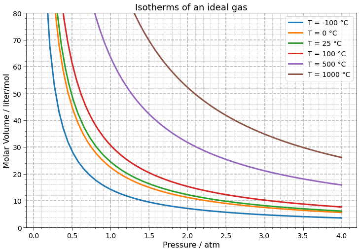
Now we can redo our graph applying the function above and using all the customization power of Matplotlib to address properly axis labels, legend and title:
fig, ax = plt.subplots(figsize=(12, 8), facecolor=(1, 1, 1))

for i, p in enumerate(points):
    ax.plot(*p, label=f'T = {round(temperatures_celsius[i], 2)} °C', linewidth=3)
    plot_params(ax)
    ax.set_ylim(0, 80)
    ax.legend(fontsize=14)
    ax.set_ylabel('Molar Volume / liter/mol')
    ax.set_xlabel('Pressure / atm')

ax.set_title("Isotherms of an ideal gas", fontsize=18)
plt.show()

# if you want to save the plot:
# plt.savefig('isotherms.png', bbox_inches='tight', dpi=150)
Sure, we can have the temperatures in Kelvin:
fig, ax = plt.subplots(figsize=(12, 8), facecolor=(1, 1, 1))

for i, p in enumerate(points):
    ax.plot(*p, label=f'T = {round(temperatures_kelvin[i], 2)} K', linewidth=3)
    plot_params(ax)
    ax.set_ylim(0, 80)
    ax.legend(fontsize=14)
    ax.set_ylabel('Molar Volume / liter/mol')
    ax.set_xlabel('Pressure / atm')

ax.set_title("Isotherms of an ideal gas", fontsize=18)
plt.show()

# if you want to save the plot:
# plt.savefig('isotherms.png', bbox_inches='tight', dpi=150)
Coding science problems
Nice graphs, right? A lot can be discussed using them and the grid lines allow quantitative analysis in an easy way. From a chemistry teacher/student point a view, we:
- stated the problem under investigation
- expressed the relevant equation
- fixed the unit system
- solved the equation for a chosen variable
- chose the fixed conditions (temperature and amount of substance)
- studied graphically the problem
- used established conventions for symbols, notations and graphs
From a coder point of view, we:
- stated the problem under investigation
- chose the adequate packages for the investigation
- expressed the relevant equation
- symbolic representation with Python objects
- fixed the unit system
- wrote relevant code comments about the unit system
- solved the equation for a chosen variable
- symbolic representation with Python objects
- chose the fixed conditions (temperature and amount of substance)
- symbolic representation with Python objects
- studied graphically the problem
- used loop structures to automate calculations
- used a graph library
- customized the plot so that it is informative
- used established conventions for symbols, notations and graphs
- meaningful variable names
- followed the style guide for the language (PEP8)
As can be seen, each step that we usually do solving a problem in an “old fashion” (on paper, using a pen and a calculator) remains when solving with programming. It is all about how to represent each step with code. Which packages to use; how to relate a given equation or value to an abstract code object; which structure to automate calculations. Same steps with different tools.
And remember: you probably try during an exam to be organized with your annotations, calculations and answers so that your teacher can understand your reasoning and give you a high score. Or, in your professional life, you probably try to be as clear as possible so that your work colleagues can understand your job and contributions. Code should be easy to read. I know it is not easy sometimes, and probably some code in this post could be clearer, but we must try to write code as close to day to day language as possible.
You write code for humans not for machines.
Last but not least, it’s important to be aware that the packages are always evolving and future changes can broke some code. It’s a good practice to state which versions were used in a given project. This way, someone trying to reproduce your work can verify if some problem is due to some update.
The following versions are the ones used in this post:
from platform import python_version
import matplotlib

packages = {'SymPy': sympy,
            'Matplotlib': matplotlib,
            'Numpy': np,}

print("Packages' versions:\n")
print('{0:-^20} | {1:-^10}'.format('', ''))
print('{0:^20} | {1:^10}'.format('Package', 'Version'))
print('{0:-^20} | {1:-^10}'.format('', ''))

for name, alias in packages.items():
    print(f'{name:<20} | {alias.__version__:>10}')

print('{0:-^20} | {1:-^10}\n'.format('', ''))

print('{0}: {1}'.format('Python version', python_version()))
Packages' versions:
-------------------- | ----------
Package | Version
-------------------- | ----------
SymPy | 1.9
Matplotlib | 3.4.3
Numpy | 1.20.3
-------------------- | ----------
Python version: 3.9.7
Conclusion
I hope you enjoyed the post and learned something new. Stay tuned for new articles and videos about chemistry and Python. Have a look in the related articles below.
That’s all folks!